While infographics seem to have been popular for only the last decade or so as part of the wave of social media-fueled content marketing, they’ve actually been around for centuries. In fact, we can still learn from infographics that are hundreds of years old.
Three oldies that I like come from 1600s Great Britain, 19th-century Russia, and 20th-century America. That first one helped Oliver Cromwell launch a full-scale invasion of the Caribbean.
Before we review these infographics of the past, it’s best to discuss what content marketing is. One definition I like comes from Copyblogger:
“Content marketing is the process of creating and sharing valuable free content to attract and convert prospects into customers, and customers into repeat buyers.”
As for infographics, Robin Richards, creative director at ripetung, gives this explanation:
“The public’s collapsing attention span has given rise to a relatively new content format: the infographic. Infographics – a visual representation of complex data – have emerged as one of the most popular and shareable forms of social content.”
Or, as I like to put it: “On the Internet, no one reads anything – they just look at stuff.” Now, I don’t wholly believe what I just stated. People WILL read your “stuff,” but in the age of information overload, you’ve got to convince them to do so, and infographics are one way to accomplish that.
So let’s investigate some ways that people have used infographics through the centuries …
Have Infographic, Will Invade and Claim Jamaica
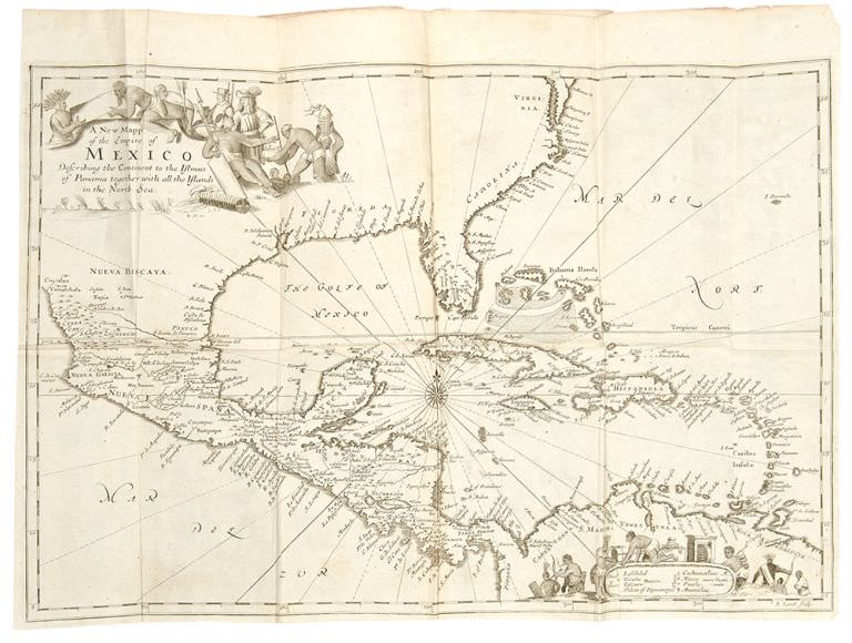
People might not think so in the age of Google Maps, but a map is an infographic. I’ve always loved maps, and some are better than others at expressing information. In fact, if done right, some maps can help plan major invasions and secure great client engagements …
In the mid-1650s, Oliver Cromwell, Lord Protector of Great Britain after King Charles I lost his head, turned his gaze to opportunities in the Caribbean. He wanted to take Hispaniola (modern-day Haiti and Dominican Republic) and Cuba from Spain. Instead, he had to settle for taking Jamaica.
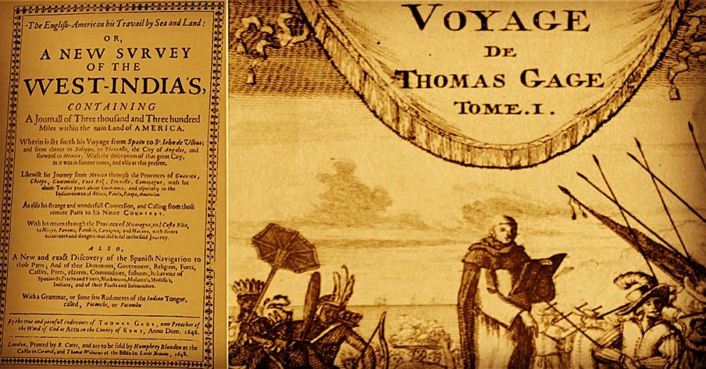
An infographic played a large role in his decision to send a 3,000-strong invading force across the Atlantic (eventually becoming a 6,000-man army) to maraud the islands. You see, earlier in the century, an Englishman named Thomas Gage had been a Catholic missionary to the central Americas.

In 1648, having lost his fortune due to disinheritance and piracy, he published his book The English-American his Travails by Sea and Land. Not only was The English-American a travelogue and political pamphlet, but it included maps and – most importantly for Cromwell – details about Spanish wealth in the Americas and the defenseless condition of the Spanish possessions in South America.
As the Scottish historian and bishop Gilbert Burnet explained, Gage’s book:
“caused a remarkable sensation. His account of the wealth and defenseless condition of the Spanish possessions in South America excited the cupidity of the English, and it is said that Gage himself laid before Cromwell the first regular plan for mastering the Spanish territories in the New World.”
For those trying to gain new clients with the help of infographics, it should be noted that the fine maps and information in Gage’s book helped secure him the post of chaplain of the invading armada.
Happy Birthday, USA – We Are Still Your Friends!
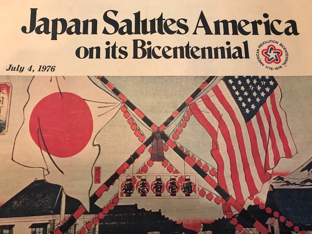
The American Bicentennial in 1976 was a big deal. Think: July 4th but on a grander scale, with “76” branding seemingly everywhere – not just at the beginning of July, but all year long.
So it wasn’t a surprise to me, when digging through my parents’ old clippings, that I found a special Washington Post insert published by the country of Japan in 1976. The insert, a small newsprint magazine inserted inside the Post, congratulated the United States on its bicentennial.
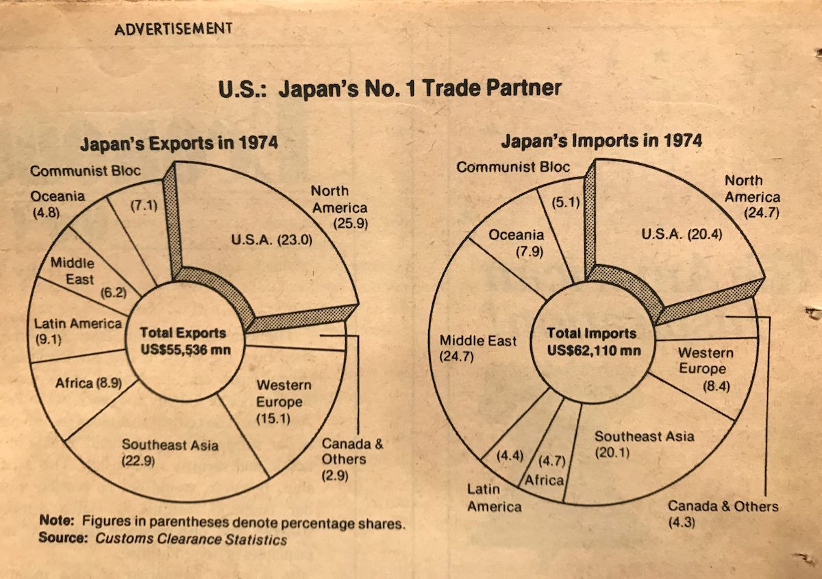
It was also an opportunity for Japan to boast about and educate Americans on Japan’s growing economic ties with the U.S. Keep in mind this was a few years before “Japan Inc” burst on the world scene in the 1980s. Inside the special insert was an infographic that was, quite frankly, boring. But effective. Why?
From an historical perspective, this infographic shows that in 1974, Japan was still a net importer in relation to the rest of the world. However, it was already starting to enjoy status as a net exporter to the United States. It was to be another decade before that trade imbalance became so big that Americans began to seriously look at Japan as an economic rival.
Keep It Simple
What I love about this infographic is its simplicity and low cost. It can be a huge undertaking to create an infographic. Worse yet, I’ve seen infographics that are so heavy with information, and so complicated, that I just pass them by.
It’s clear that the Japanese didn’t break the bank for their insert. They paid for a full-color cover, but everything on the inside was black-and-white newsprint, including the infographic. And the infographic is simple and easily digestible. Win. If it looks incredibly boring to modern eyes, a graphic like this did not give off an air of low-quality at the time. It worked.
In relation to modern practice, the simplicity of this infographic contains a further lesson: make the visual easy to digest. Infographics should be able to be viewed easily on desktop, tablet, and smartphone screens. The user experience should always be top of mind.
Russian City Populations in 1897: Forget the Boring Chart and Have Some Fun

When I first saw this infographic from pre-Revolutionary Russia, it really stood out to me. Not necessarily because of the content, or the Cyrillic characters, or the design, but because of the date: It was published just a couple weeks before my grandfather was born in Kazan, Russia in early 1897.
To give you an idea of what those times looked like, this is a photo of my grandfather as an infant with his mother and father: my two great-grandparents, Russian Orthodox priest Alexander Pokrovsky and his wife Nadezhda. The photo seems a far cry from today’s world of easy Internet access around the world!
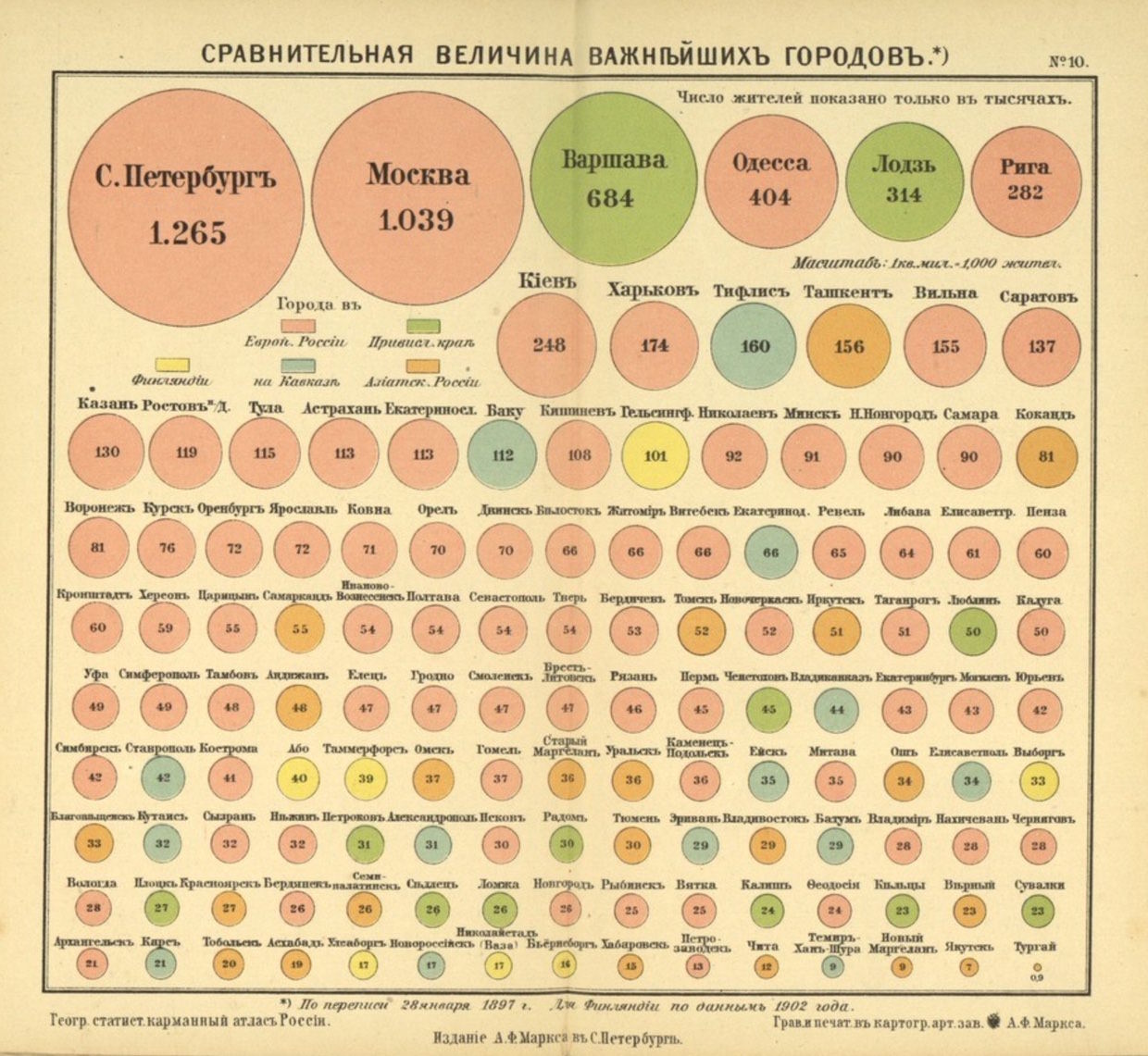 The infographic lists the populations of Russia’s largest cities. This could have been accomplished by simply listing them in table format. But the cities are shown starting with the largest populations first, as denoted by the sizes of the circles. What’s more, the regions of Russia (European Russia, Caucasus, and so forth – even Finland is listed) are denoted by color coding.
If it was just a table of cities, most would probably pass this data by. But it’s hard not to take a closer look when presented in such a way.
Note
* Mark Smiciklas, https://intersectionconsulting.com/2011/the-power-of-infographics/